This site is a prototype presenting a Modern Theme for The Urantia Book. The book's words remain unchanged from the Standard Reference Text; only emphasized words are bolder, and numbered lists are neater. The Foreword is an excellent place to see the changes because of its many types of lists. Please see the Project Notes below for details about this project. You can help by reviewing this Demo and completing a brief, anonymous Survey.
This demo version uses the Standard Reference Text to present the Urantia Book's Foreword and the first 15 papers. The text is unaltered, though some formatting is updated to present the content clearly and to help with understanding. Here you will find a Modern Theme that includes:
1.
Increased boldness of italicized words and words in ALL CAPS.
2.
Proper alignment for the hundreds of numbered lists and tables interspersed throughout the papers.
3.
Sans-serif font for best legibility on devices.
4.
Hidden reference numbers.
As time passes, it becomes less easy to learn why certain decisions were made that affected typesetting for the first printing of the Urantia Book. Evidently, a complete typewritten version was supplied to a Chicago printing company. This version probably had numbered lists in paragraph form. Numbered lists and other multicolumn data are difficult to produce with a manual typewriter. For example, numbered lists are generally presented with numbers under numbers and text under text. It seems that for convenience, numbered lists were shown as numbered paragraphs. When column data was not enumerated, elements were separated by rows of dots.
The formatting of lists must have been discussed with the publisher. The Urantia people were likely informed that arranging the lists into proper columns and rows could be done, but this would incur significant added costs. The tables would need to end properly on each page that contained them. And this would involve actual typesetting with movable type, not the low-cost computer typesetting we can do today. Including properly formatted tables and lists may have increased the cost of the first printing by thirty percent or more. It's just speculation, but did higher cost hinder a more desirable presentation?
EmphasisIt's been reported that the revelators underlined the words to emphasize. This underlining was probably continued in the version sent to the printer since italics would not have been possible on typewriters of the day. It is unclear if the idea of emphasizing the italicized words further with bold type was discussed. The Demo makes the italics bolder, as it does help in the overview of paragraphs.
Modern ThemeThis project supplies a vision for how the book may have been formatted if modern processes had been available at the time of its first publication. You may find that the proposed formatting will make the Urantia Book more readable and accessible for a wider, and maybe younger audience. The changes could make studying easier while using devices like phones and tablets.
Bonus Feature!Many web browsers offer Text-to-Speech services to read websites aloud. They usually have features to customize voice and speed. Try it with the revelation. It may say some words wrong, but sometimes it is easier to listen.
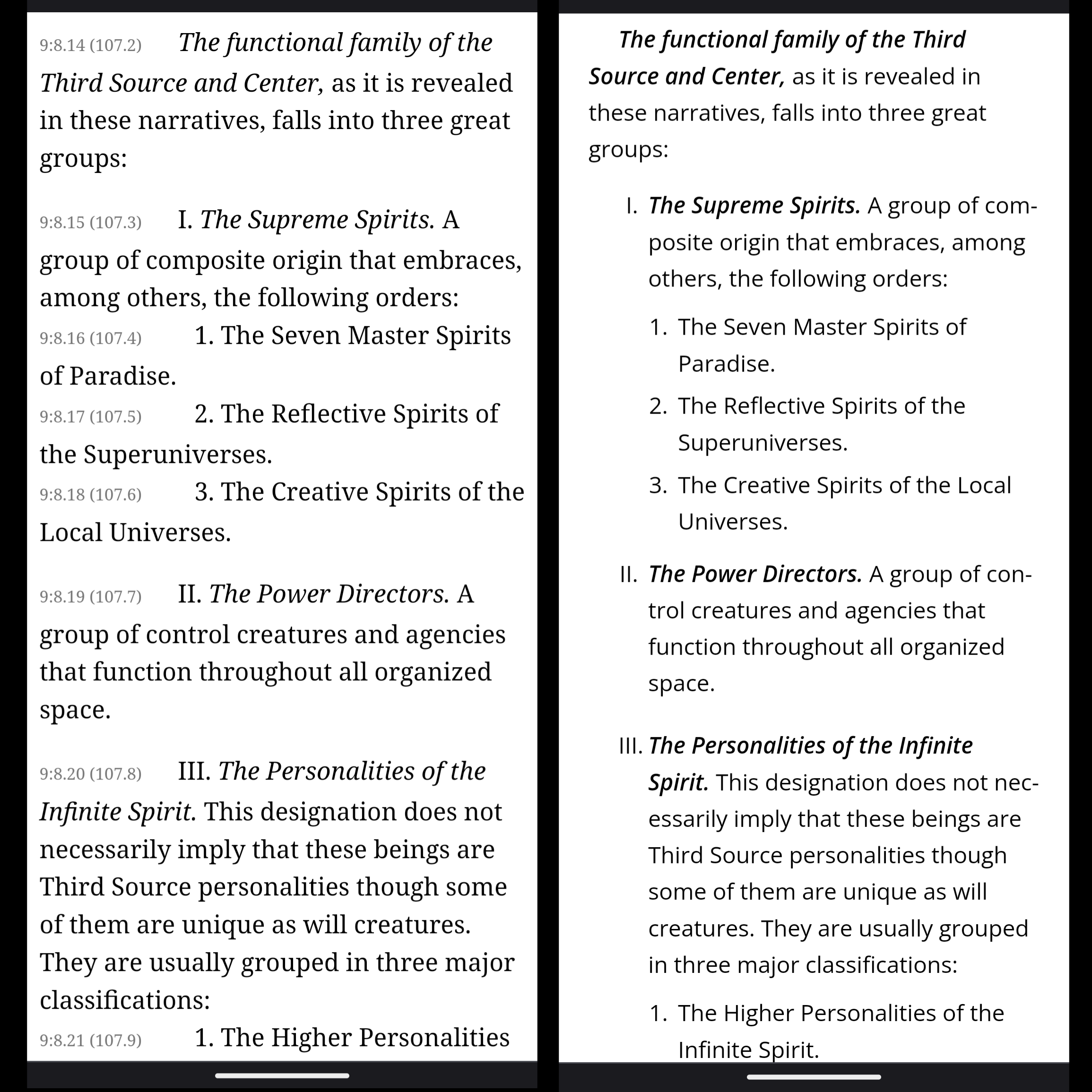
Comparison from Paper 9, Section 8
Another concept can be implemented in this updated theme. In the print version, sometimes extra space is given between paragraphs to indicate a change of direction without starting a new section. It might be helpful for digital versions to indicate this spacing with a faint line.
Default Fonts for DevicesThe plan is to permit a choice of fonts in settings, but for a default, studies suggest that sans-serif is more legible on smaller devices like phones, and for electronic reading in general. AI provided these sources for this evaluation:
1.
"Comparing the Legibility of Display and ClearType Fonts on LCD Screens" by Bonnie K. Stone and John F. S. Connolly (2006): This study compared the legibility of serif and sans-serif fonts on LCD screens and found that sans-serif fonts were more legible at smaller sizes.
2.
"Web Font Legibility: Serif vs. Sans Serif" by Sagi Haviv (2013): This study tested the legibility of serif and sans-serif fonts on a variety of digital screens, including phones, and found that sans-serif fonts were generally more legible.
3.
"Typographic Legibility on Mobile Devices" by Bichlien Nguyen and Wei Luo (2017): This study investigated the impact of font style, size, and line spacing on legibility on mobile devices and found that sans-serif fonts with larger font sizes and increased line spacing were the most legible.
"These studies provide strong evidence for the use of sans-serif fonts on phone screens. However, it's important to keep in mind that legibility can also be influenced by factors such as lighting conditions, screen resolution, and individual visual acuity, so it's always a good idea to test font choices with your specific audience."
You can read the introduction to Sue Lyon's book "The Bold & Italicized Words" for related information.
UB Modern Theme Demorevelationary.net
a project of masteruniverse.org